We Are Open Circle

4 month end-to-end UX Research, Design, Testing & Front-end implementation
Website re-design for Organizational Development company. Special focus on Information Architecture and UX Copywriting.
Tools used: Figma, Miro, Invision, Illustrator, Photoshop, Lightroom, Premiere, Zoom, Hotjar, SquareSpace
Problem
Unclear messaging, inconsistent read patterns, lack of CTA
Hypothesis
If we create more user-friendly content chunking, it will solve the 60% drop off rate
Solution
Connect with user by focusing on their problems,
instead of leading with marketing slogans
Success Metrics
-Bounce rate ↓ from 67% to 51%
-Page views ↑ 7%
-Search traffic ↑ 325%
Issues from Audit:
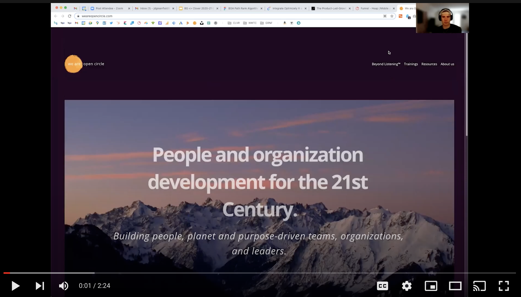
OLD Homepage

click for video preview
Confusing messaging- unclear what service is provided
Inconsistent Hierarchy- text body & image cards not uniform
Unclear Task Flow- users aren’t funneled in any particular direction
No proof of demand- clients page is just logos
Text heavy- Scrolls past fold, no clear F or Z read pattern
Lacking hooks of engagement- no videos or ways to interact with offerings
OLD Product Description Pages

Continuity & Closure issues
No consistent text & image cards

Text Heavy
no clear read pattern